Magic Brand
Greetings reader, I hope you are well. This is part of an unpublished blog post I drafted nearly a year ago, so thought it was timely to update. It’s also a year to the day Mr Quinn made his stage debut here, and I look forward to treading the boards again soon. In the meantime I’ve been practising more close up magic.

During the current climate I’ve also been busy working behind the scenes on my act and the Mr Quinn brand. Creating an identity within the realm of magic is a fascinating process. Whilst I have been honing Mr Quinn’s background story and scripting routines, I have also developed concepts for logos/idents to suit the character. Originality and consistency is the challenge.

The Mr Quinn logo has gone through numerous iterations, prior to settling on a simple minimalist design atop this post. This will also prove beneficial for replicating in print and other formats for the future. There is also a theme that I’ve tried to keep consistent throughout; mystery and sci-fi. Having dropped the monikier ‘Mysterious’ for now, inspired by the Agatha Christe novel, Mr Quinn continues to be the brand name. The name’s also inspired from the Mr Men, Mr Benn and Mr Bean.
So, check out some of the following designs for Mr Quinns brand in chronological order, some of which have been shared on my Instagram @mister.quinn . Incidentally, Instagram has proved a great means of sharing ideas, so a big thank you to those who gave feedback on the various designs.

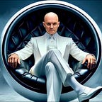
Mr Quinns trademark glasses. The classic Dark Tortoise shell Yvan frames by Curry & Paxton, as worn by Sir Michael Caine in both “The Italian Job” and the Harry Palmer films. I’m a big Michael Caine fan and love the retro look of these glasses that I wear on stage as Mr Quinn. A distinguised looking font.

A Quinn ambigram. This idea stemmed from some concepts for a Quinns deck of playing cards. The logo reads the same either way up.

An abstract design for Q Division, a secret project. This is based upon a flying saucer looking emblem and all seeing eye, with a letter Q feel to it. I rendered some of these with music effects too.
A metallic render of the Q logo floating in space, with some lens flare. The hypnotic score of Mings Ring from the Flash Gordon movie soundtrack.
Simple black design, with a hypnotic effect and the Logans Run movie theme.
Concept for a Mr Quinn channel ident, with background music from Picture Box, which had a haunting theme tune

A concept with Mr Quinns shadow as the letter ‘I’. Liked the idea of adding the character within the font. A ‘The Man from U.N.C.L.E’ and ‘The Saint’ vibe. This formed the basis towards an opening ident I created, from a sci-fi film trailer soundtrack and some hip hop beats.
I then created the following abstract. Would make for a nice pin badge perhaps? Mr Quinn likes badges.

And from that I started concpetualising a cartoon character for Mr Quinn. An alien type being floating in space. Somewhat inspired by the Mekon from Dan Dare.


From the alien character, inspired the following abstract Q. A question mark, that looks like an alien and the letter Q.

The following is a more corporate looking design. I liked the idea of incorporating the mobius strip. Note the use of just ‘QUIN’, mainly for design reasons, although this harks back to the original spelling of the Agatha Christie novel. We’ve come full circle!

As you can see, throughout the past year I’ve been testing out all kinds of designs and interations for the Mr Quinn brand look. There are plenty more that didnt make the cut. Artist’s tears, as Rob Zabrecky would say. As a side note, do check out Rob Zabrecky’s latest interview with Harrison Greenbaum. With excellent guest appearances from John Lovick and David Kovac!
Abracadabra!
The design process is fun and challenging, seeking original ideas and looking for inspiration. That inspiration struck recently, from the excellent design by the talented Blake Vogt.


Do check out these fabulous magic themed prints, currently available via Vanishing Inc. Theres a great story behind its conception too.
So working with a similar principle of the design, I discovered some great looking fonts online to replicate the one Blake had designed himself. I liked how it looked abstract and minimalist, and reminded me of a maze. I’ve also been looking at film titles. I’m a bit of a movie buff and always loved the intricacy of the logo of Christopher Nolans ‘Syncopy’ company and his movie ‘Inception’.


Which again, reminded me of the neat Vanishing Inc design for their online Masterclasses.

Initially I worked with a few fonts to come up with the following.

Then working on a few variations, shared via Instagram to get some feedback. Incorporating my previous design to finally come up with these inverted options.

And with a few tweaks this is the final design below, for now. A nod to magician and designer @diesel_illusions for mentioning the use of the shadow figure again.

And a few variations.


I hope you enjoyed a quick peek behind the magic curtain, throughout this adventure. I always strive to seek inspiration from within all my interests and how they connect with my character. Be it movies, music, comics and other entertainers. I always keep a sketchbook of designs and a virtual scrapbook of imagery.
Shout out also to Nikola Arkane for her brilliant blog, that has been a constant source of inspiration. Do check out her latest posting, which gave the impetus on sharing my post, via Nikolas journal.
Thank you also to inspiration from the Coolest Magician On Earth, Rudy Coby! With his excellent advice from his brilliant Lab Notes: ‘How to Become a World Famous Magician’.
I hope you’ve enjoyed this journey so far, which constantly evolves as we embark upon establishing a character and brand in magic.